I have a particular passion for branding.
It started when I was a kid, although I didn’t come into contact with the term branding until AFTER I finished my Bachelor’s degree. But this didn’t stop me from studying all aspects of branding.
I’ve taken online classes, workshops, a bootcamp, and joined a coaching group. I have studied brand identity design, brand voice development, and brand strategy facilitation. Naturally, I have read many books on different experts’ thoughts processes surrounding branding.
During this time, I ran a social media account discussing branding in the hopes of at some point offering specialized services. There’s a time and a season for all things, and it turned out that wasn’t my time. But I really enjoyed creating this content, and looking back, I rather like some of what I did.
I started out targeting brand identity design for yoga and other intentional movement studios, and transitioned to personal branding at some point. I’d like to walk you through the shift.
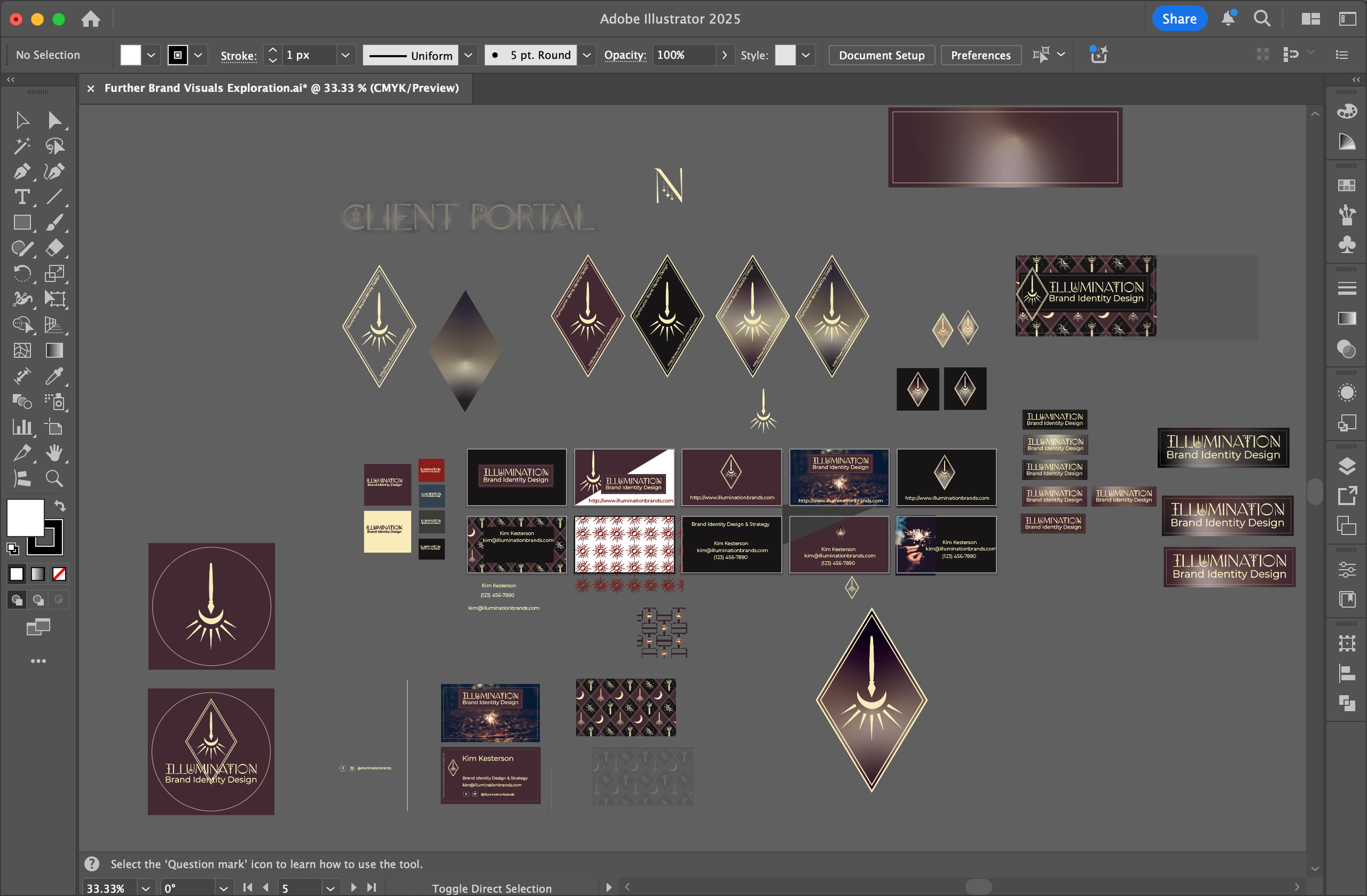
The Yoga-Focused Brand

My target client was a spiritually minded female yoga studio owner in her 30’s. I imagined my brand as sort of magician archetype bringing these visual identities into the light.
This color palette was this dusty purple (not too intense because yoga is serene) and LIGHT. Meaning the physical concept of light, represented through a pale yellow. I designated green and red as accent colors. Green to soothe and red to pop- to be used strategically.
The primary font was simple, but decorative, with a bit of an Indian feel to it.
I constructed a logo that represented the word luminosity in many ways- a pen (symbolizing my work) dipping into a well of ink, which was at one the shape of the moon and the radiating sun. It was all stacked in such a way that it also looked like a hanging light fixture.

The photography direction was mainly images of figures in yoga and dance poses. Sometimes I would use the images normally, and often, I would overlay them so they looked almost like silhouettes with various levels of light emanating from behind them. I thought this was lovely and played nicely with the brand concept of light and the clients it would serve.
The Personal Brand Focus
When I transitioned to personal branding, my target client changed. Anyone in an field could have a personal brand, but I figured it might be more of the corporate type individual who would be likely to pay for these services.
I took everything in a bit of a bolder direction. The dusty purple became a vibrant indigo-purple, paired with a bold warm red. The concept of light remained, but became more of an accent and morphed into a neon red-orange.
The idea is that we would be building and displaying their legacy, their story. And I wanted the branding to subtly give the impression of writing a story.
I took on more of a professional, clean serif typeface for my display font, and a body font that gave a vague feeling of a typewriter.
The photography direction went more in favor of professional looking individuals, their faces fully lit. I drew custom symbols that looked hand drawn with neon effects. These were a nod to storytelling- a fusion between ancient story through symbols like hieroglyphs and modern day electricity.